Figma, Notion
Swift track
A closer look at how great ideas take shape one story at a time.

Final solution that shipped.
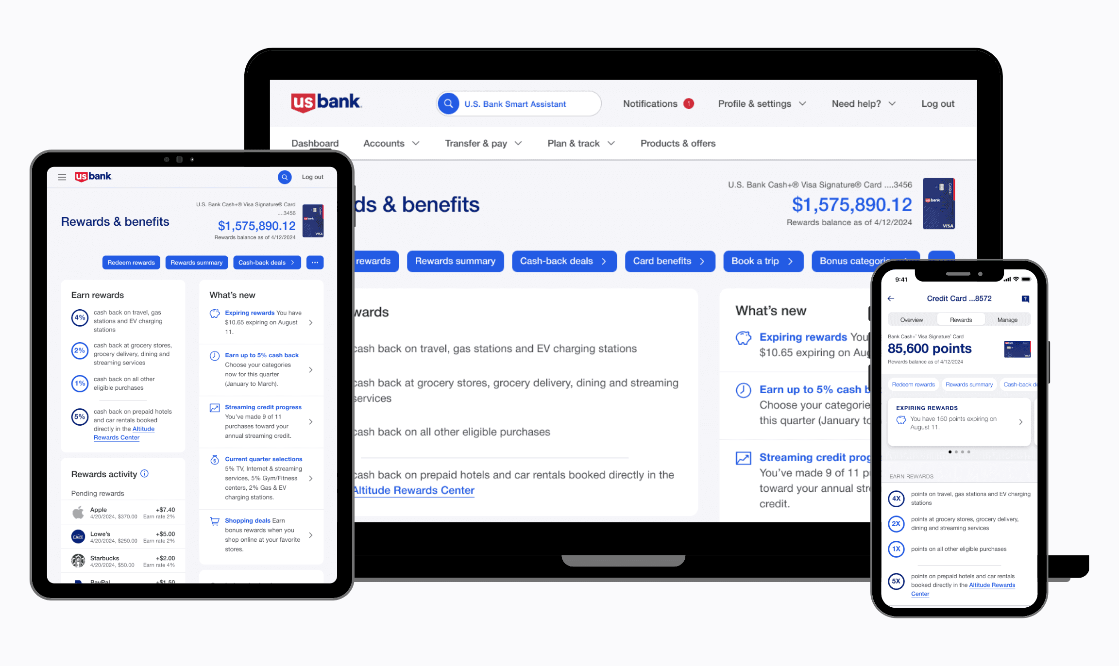
The final experience unified how rewards value is presented, reduced competing redemption paths, and introduced a scalable pattern system used across web and mobile surfaces.
The challenge wasn’t rewards instead it was cognitive load.
I immediately dove into understanding the legacy rewards platform and uncovered that customers earned rewards easily but struggled at the moment of redemption. The experience varied across card products and platforms, forcing users to translate points into value on their own.

My key finding was the issue wasn’t motivation—it was cognitive load at decision time.
How I approached the problem.
Instead of optimizing individual screens, I focused on the moment where users hesitated most when deciding whether and how to redeem their rewards. That meant stepping back from card-specific requirements and designing for decision clarity across the system, so improvements could scale across products, platforms, and future use cases.
My key finding was the issue wasn’t motivation—it was cognitive load at decision time.
Evidence that shaped decisons.
To understand why customers hesitated at redemption, I combined behavioral data, decision psychology, and a deep audit of the rewards ecosystem—including product constraints, APIs, and redemption rules across card types.
This helped separate what users needed from what the system could realistically support.
Decision psychology & rewards motivation
Research on rewards motivation and choice overload reinforced that clarity and perceived value matter more than increasing the number of options especially at moments requiring commitment.
Key insight I gathered was that motivation drops when users can’t confidently evaluate value.
Behavioral and system-level signals
To ground these insights in reality, I reviewed rewards usage data and worked closely with engineering and product partners to understand how rewards logic, APIs, and product rules varied across card programs.
This revealed where user confusion was driven by system fragmentation, not just UI.

While competitors varied in execution, the strongest experiences consistently reduced cognitive effort at redemption reinforcing the decision to focus on clarity over flexibility in the U.S. Bank experience.
Competitive signals
To understand how other financial products framed rewards value and redemption, I reviewed comparable experiences across major card issuers and digital wallets.
The goal wasn’t to replicate patterns, but to identify where competitors clarified value and where they introduced similar decision friction.

While competitors varied in execution, the strongest experiences consistently reduced cognitive effort at redemption reinforcing the decision to focus on clarity over flexibility in the U.S. Bank experience.
Balancing user clarity with business constraints
Together, these signals pointed toward a solution focused on decision clarity—standardizing value framing and guiding redemption choices—while preserving flexibility behind the scenes.
The goal wasn’t to simplify the system—it was to simplify the decision.
Aligning across product, engineering, and design.
As insights emerged, the challenge shifted from what was broken to what we should prioritize first. Rewards complexity touched multiple systems, card products, and technical constraints making alignment critical before moving into deeper design exploration.
To move forward, I facilitated a working session with product, engineering, and design partners to align on user friction, system constraints, and where design could most effectively reduce decision complexity.


This session helped narrow the scope from a broad set of possible improvements to a focused set of decisions to explore specifically around value framing, redemption guidance, and consistency across products and platforms.
Alignment reduced rework more than additional exploration would have.
Focusing the problem space.
The alignment session revealed where confidence broke down at redemption. I synthesized these insights into a small set of representative behaviors to guide design decisions without over-indexing on edge cases.


A shared understanding of key behaviors enabled faster, more confident design decisions.
From exploration to a scalable solution.
I began with low-fidelity explorations to test how changes to value framing and redemption guidance affected confidence at the decision moment before investing in UI polish or system changes. These early explorations focused on structure and hierarchy, not visual styling, allowing us to validate direction quickly.
Early exploration helped validate direction, not details.
Decision to ship an MVP.
Based on early signals, we made the decision to ship a focused MVP rather than continue broad exploration. The goal was to validate the core interaction—clear value and guided redemption—using existing platform components wherever possible.
This allowed us to move quickly while minimizing risk.
To accelerate delivery, the MVP leveraged existing platform patterns—adapting components like the activity feed to support rewards visibility and actions.This approach reduced engineering overhead while allowing us to test the core experience in production.
Next work