Platform UX, Product Strategy, Systems Design
Making subscriptions visible, understandable, and controllable
A subscription management experience that surfaces recurring charges early, clarifies renewal timing, and gives customers control before costs escalate.
Visiblity into banking patterns
↑ Early awareness
MVP → scalable system
↓ Support dependency
Cross-product consistency
Clear cancellation paths
New subscription detected
Cancellation requires merchant confirmation
Role
Senior Product
Designer
Team
PM, Eng, Data, Legal, VD
Platform
iOS, Web (OLB)
Duration
10/2024 -04/2025
Overview
Customers often discover subscriptions after they’ve charged when trust is already broken. This work focused on shifting subscription management earlier in the experience, giving customers visibility and control before renewal or cancellation becomes reactive.
The solution evolved through research, constraint-mapping, and rapid iteration across mobile surfaces already used for day-to-day money management.
The proposed solution.
The proposed solution unified subscription visibility and control into a single, predictable experience. It focused on surfacing status first, then enabling safe actions without disrupting the broader dashboard.
The solution introduced a consistent control model across desktop and mobile, allowing subscription management to scale without fragmenting the core experience.
Framing the problem.
Rather than starting with feature ideas, the problem was framed around moments of uncertainty where users hesitated because the system failed to clearly communicate status or outcomes.
This framing led to three guiding principles that shaped every design decision.
Evidence shaping decisons.
Design decisions were grounded in behavioral insights, system constraints, and patterns observed across comparable financial products. Together, these signals clarified where the experience needed to be precise and where flexibility could safely exist.
Platform constraints
• Mobile apps must use native payment SDKs
• Web platform cannot access transaction metadata
• Push notifications limited to subscription events only
Business rules
• Cannot modify or cancel third-party subscriptions directly
• Refund requests must route through original merchant
• User consent required before any payment method changes
API limitations
• Subscription data sync limited to 24-hour intervals
• No write access to merchant subscription systems
• Rate limits prevent real-time subscription discovery
User expectations
• Expect immediate cancellation without waiting periods
• Assume full control over all linked subscriptions
• Want proactive alerts before any charges occur
Decision psychology & rewards motivation
Research on decision-making reinforced that confidence drops when value is unclear or options compete at the moment of choice.
Behavioral Research
LOSS
GAIN
Loss Aversion & Risk
Kahneman & Tversky (1979)
Why it matters
Users weigh potential losses more heavily than equivalent gains. In subscription flows, canceling feels riskier than saving money.
Behavioral Research
?
?
?
Uncertainty Avoidance
Van den Bos / Hsee & Weber (1999)
Why it matters
When outcomes are unclear or delayed, users avoid acting altogether and repeatedly check status.
Behavioral Research
System Status Visibility
Nielsen Norman Group
Why it matters
Clear, immediate feedback builds trust. Without visible state changes, users assume actions failed.
Users hesitate when outcomes are unclear not when options are limited.
System constraints
Deep dives with engineering surfaced platform and API constraints that directly impacted what could be surfaced in real time and how states could be reconciled. Understanding these constraints early helped distinguish design problems from system limitations.
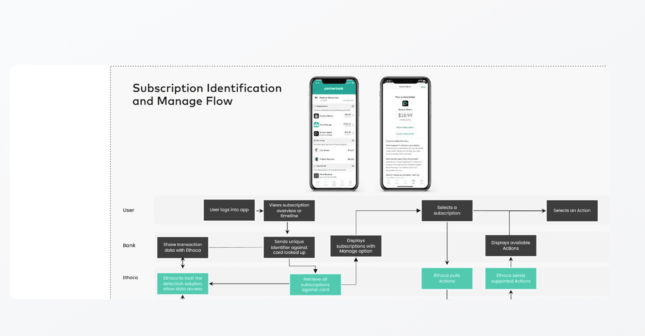
Subscription Data Flow & System Constraints
Designing for incomplete and delayed information
Transactions Feed
Card transactions, merchant data
probabilistic data
Classification Service
Detects recurring charges
Subscription Platform API
Normalizes status, renewal date, eligibility
delayed confirmation
Partner APIs
Apple, Amazon, streaming providers,
merchants
merchant-owned cancellation
Product UI
Web + Mobile dashboard
Some user pain points reflected system fragmentation, not UX gaps.
Competitive landscape
A review of comparable financial products showed a consistent pattern: the strongest experiences guide decisions through clear state communication rather than offering expansive controls upfront.
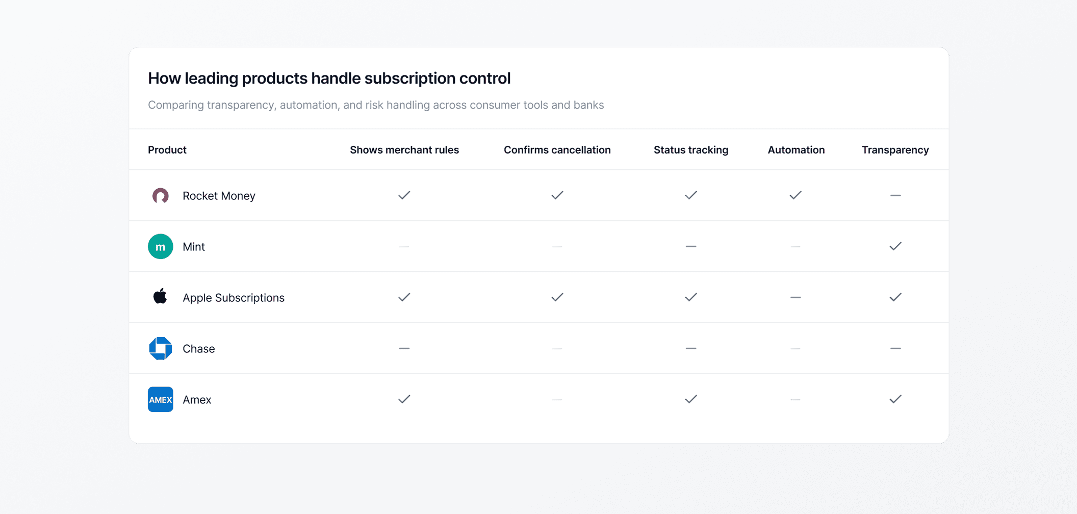
Strong platforms guide decisions instead of expanding choice.
User-reported signals
Survey responses helped validate where uncertainty existed at scale, particularly around understanding subscription status and upcoming charges. The data was used to prioritize focus areas not to prescribe solutions.
Survey data reinforced that uncertainty clustered around status and outcomes, rather than the availability of actions.
Aligning on a shared direction.
With multiple constraints and interpretations in play, the immediate challenge was alignment not ideation. A focused 3 day design sprint created shared understanding across product, engineering, and design, enabling the team to converge on a clear direction quickly.


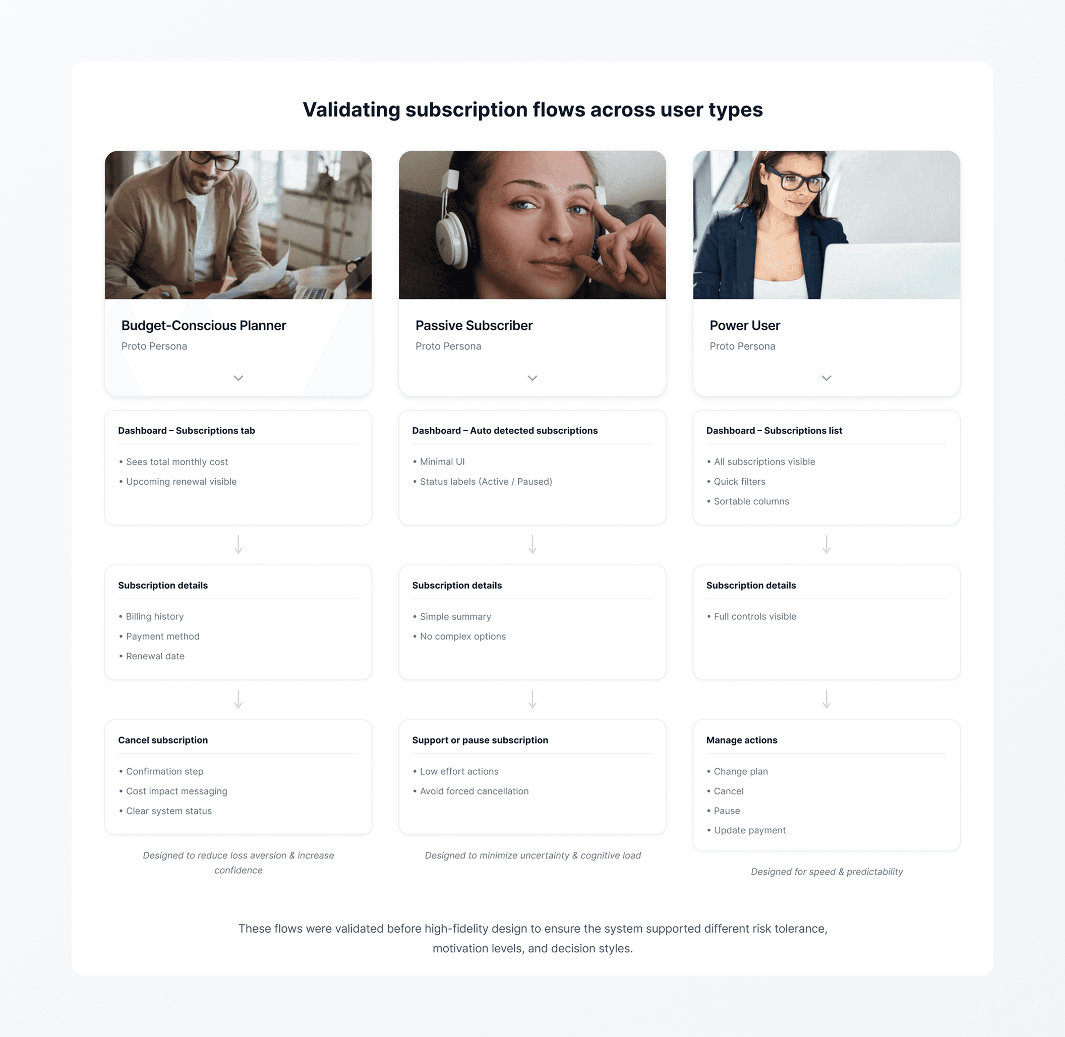
Rather than detailed personas, representative behaviors were used to anchor discussion around real decision patterns observed in the data.
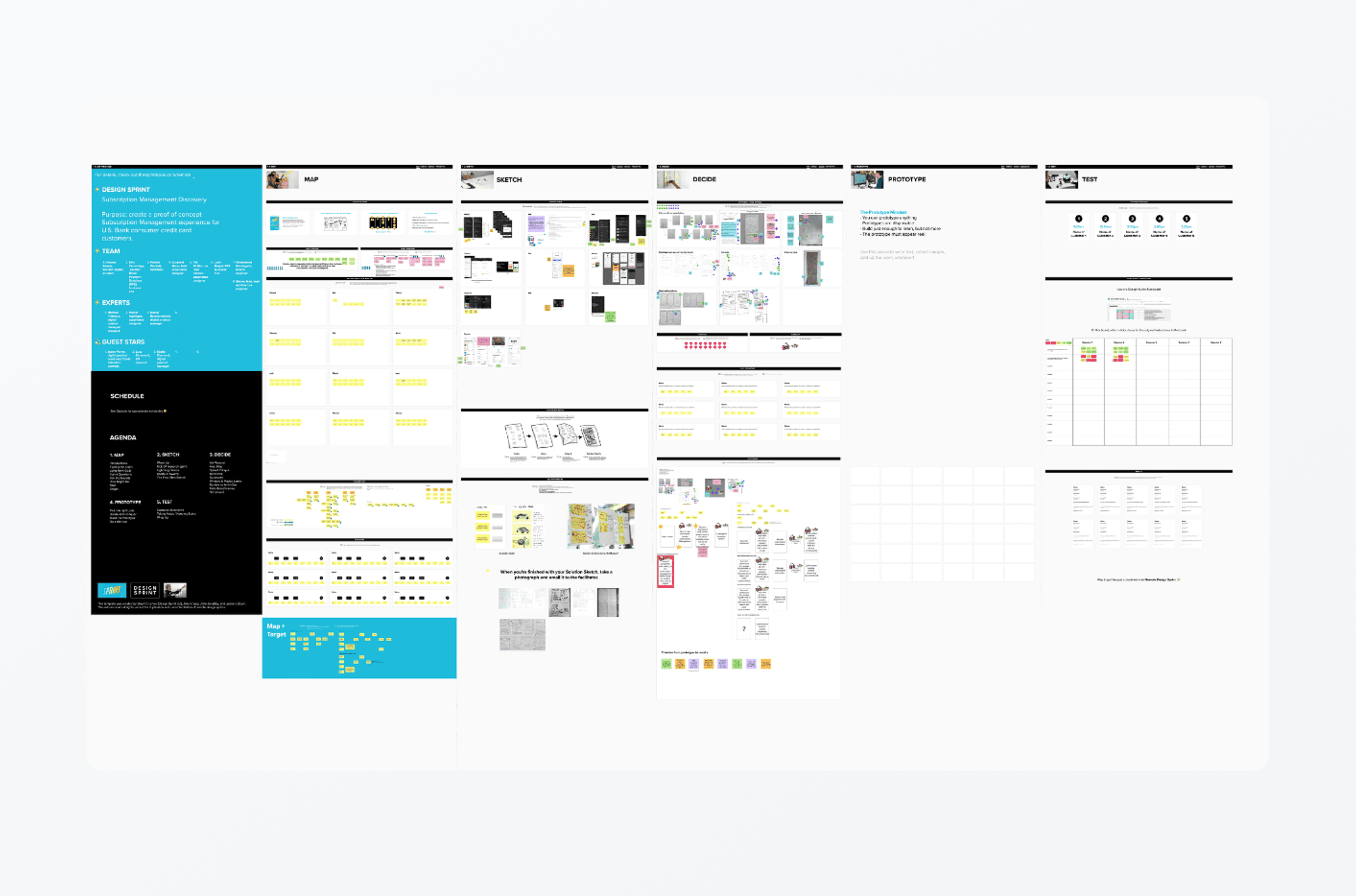
Rather than generating more ideas, the sprint narrowed the problem space—aligning the team on which behaviors mattered most and which complexity could wait.
From fragmented actions to a coherent flow.
Once a direction was aligned, the focus shifted to validating the end-to-end experience. User flows were used to pressure-test decisions across states, edge cases, and system constraints before committing to UI.
Flow validation exposed risks earlier than screen-level design.
Structural exploration.
Greyscale wireframes were used to validate hierarchy, information order, and interaction structure without the distraction of visual design. This allowed faster iteration while preserving focus on decision clarity.

Early structure testing prioritized comprehension over polish.
Committing to a direction.
Once the structural direction was validated, fidelity increased to test realistic flows and edge cases. This allowed decisions to be evaluated in context without prematurely committing to final UI.
Increasing fidelity surfaced interaction gaps that were not visible in static exploration.
Execution paused before validation revealed.
Contract timing limited the ability to ship or test live, requiring design decisions to be made without the safety net of production data. Rather than pushing prematurely toward implementation or visual polish, I focused on clarifying core behaviors through greyscale flows, stress-testing assumptions before committing to high fidelity, and documenting clear decision rationale that another team could confidently carry forward.
This approach treated the pause as a design constraint prioritizing clarity, transferability, and long-term impact over short-term output.
Validation exposed mismatches between assumed flows and real decision behavior.
Expanding the solution.
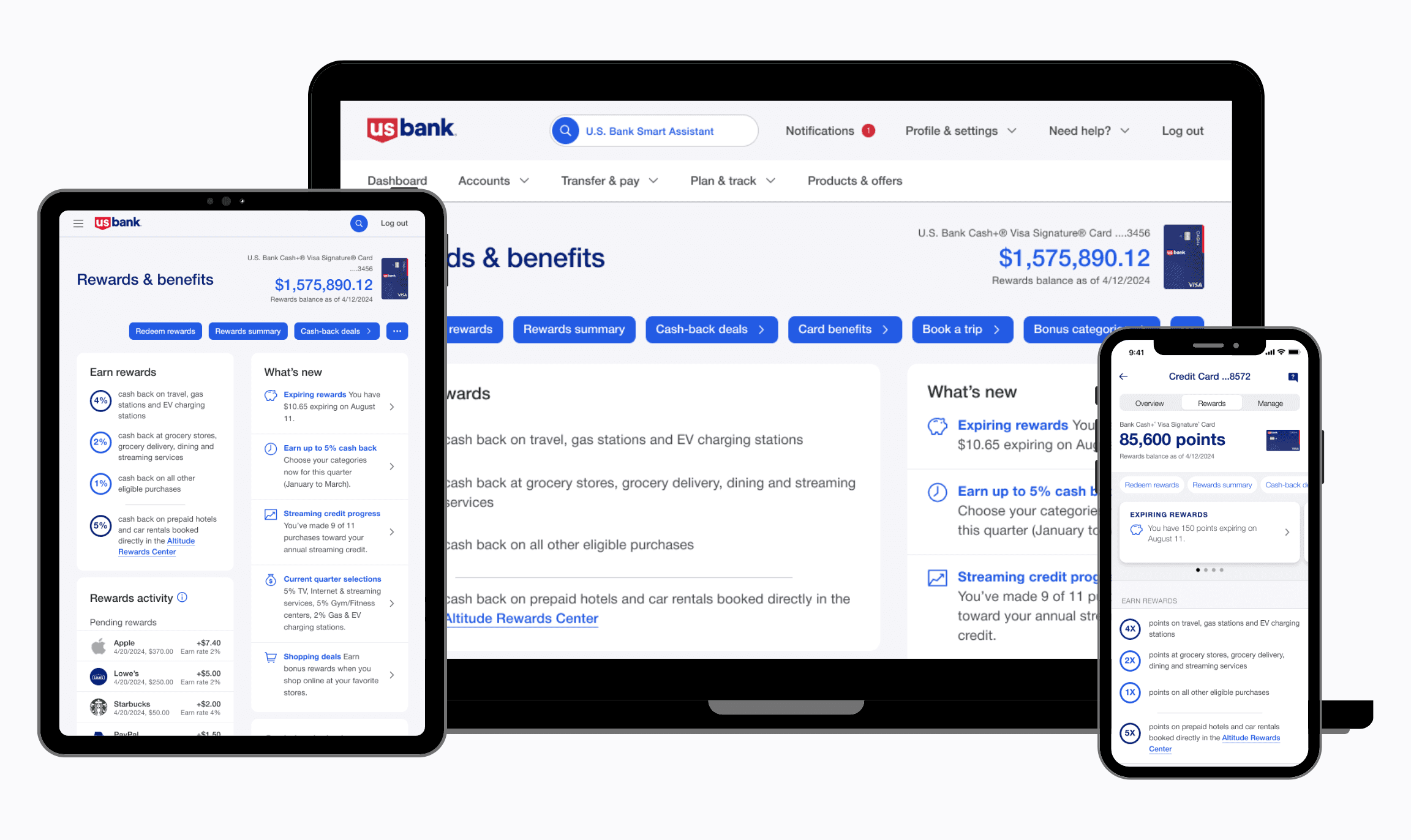
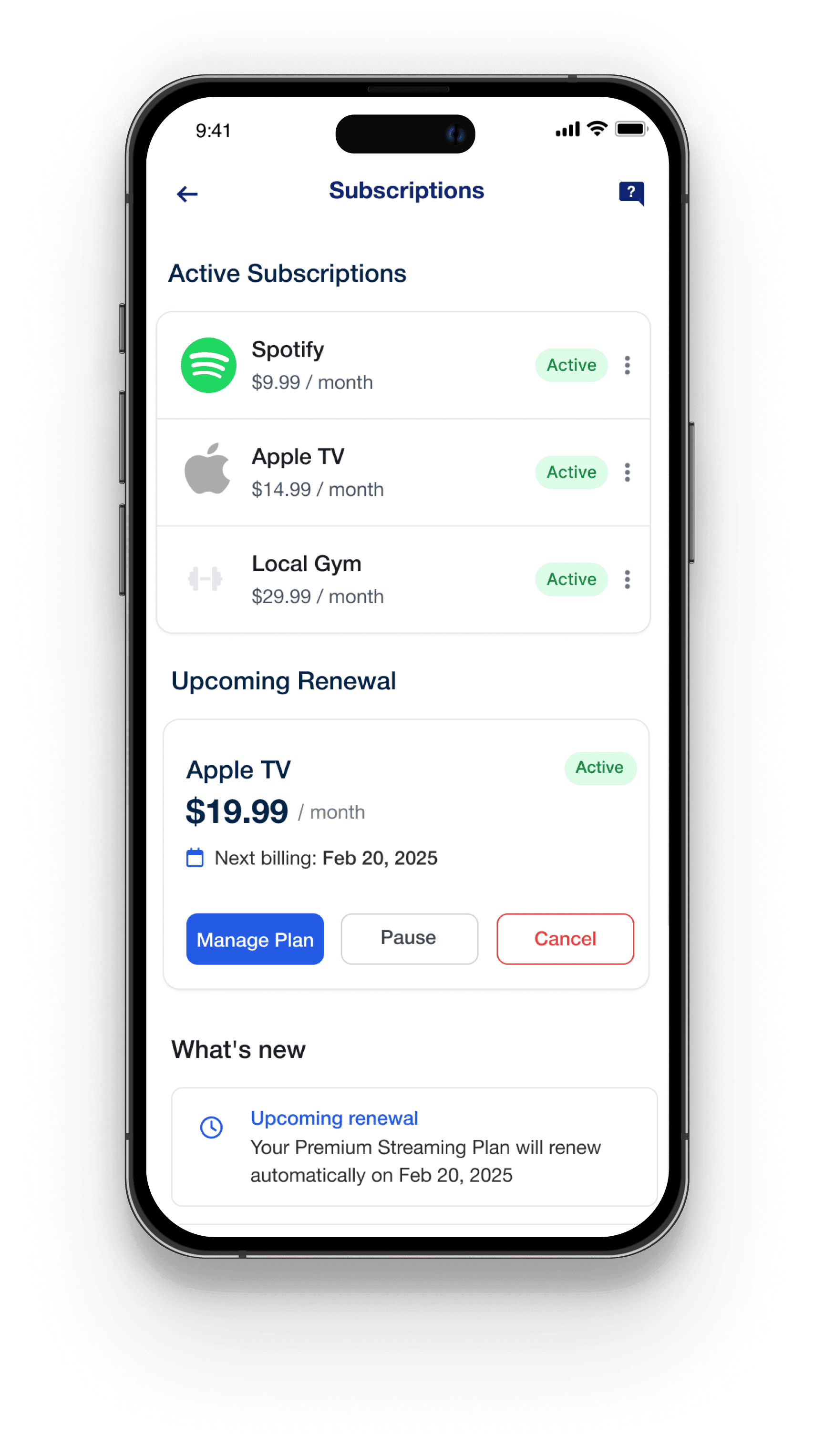
As the work moved into high fidelity, it became clear that subscriptions couldn’t live solely within an activity-based pattern. Unlike rewards, subscriptions require ongoing management—not just visibility into past actions.
To support this, the design evolved into a Subscription Management Hub: a dedicated entry point to view, manage, and take action on subscriptions over time, intentionally diverging from the rewards activity model to better match recurring behaviors.
Recurring charges demanded a management hub, not an activity feed.
The final flow from discovery to management.
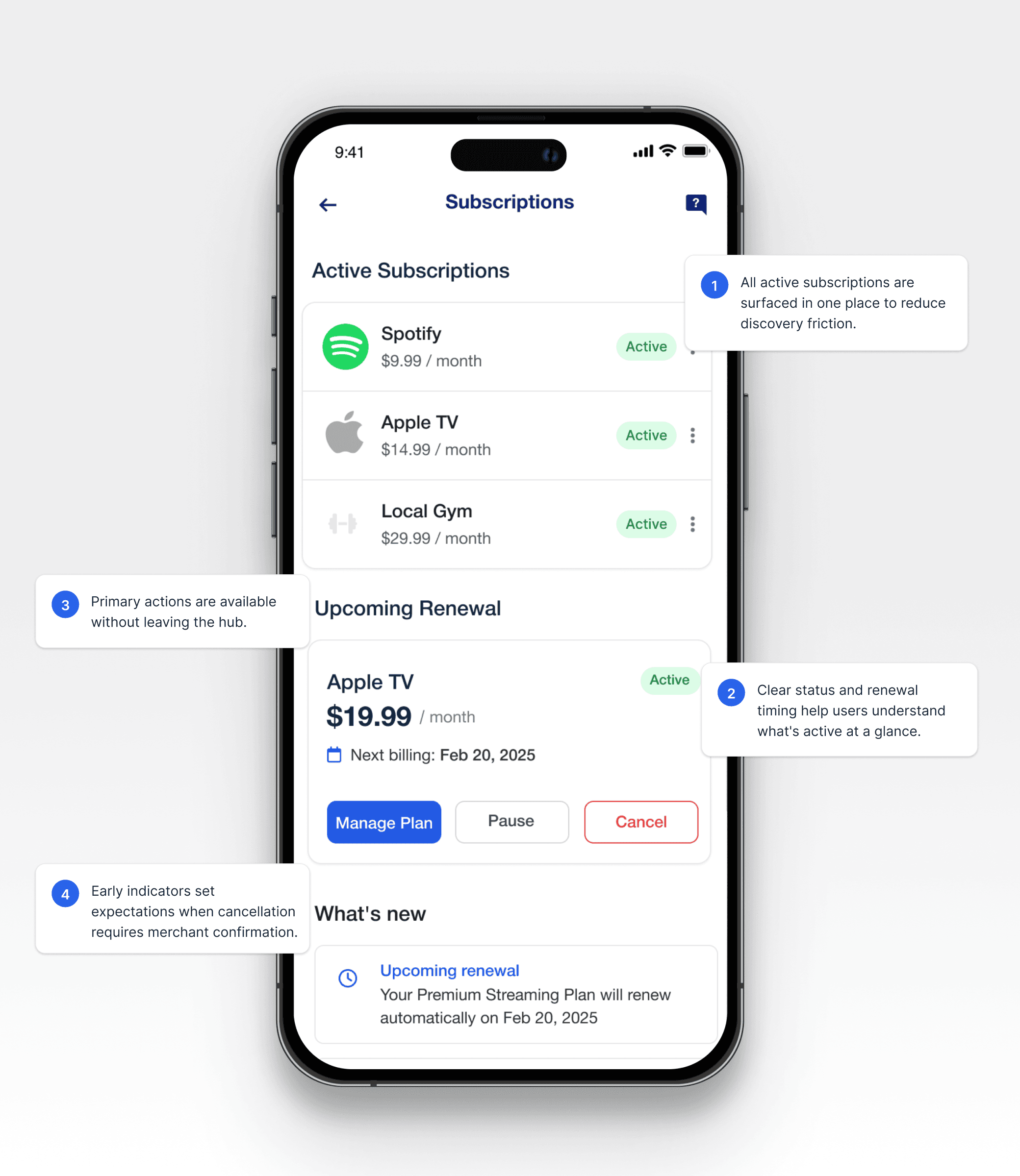
With the hub established, the final flow focused on making subscription discovery, review, and management feel connected without pulling customers out of their existing banking context.
Step 1
Subscription appears in dashboard
I designed the system to automatically detect recurring charges and promote them into active subscriptions. This removed the need for manual tracking and gave customers a single source of truth for what they’re paying for.
Step 2
Manage subscription
From the hub, customers can view plan details, billing history, and take action — pause, update payment method, or cancel — without breaking their primary banking flow.ons hub surfaces active plans, upcoming renewals, and key actions in one view
Step 2
Cancellation experience appears in dashboard
I designed cancellation to prioritize clarity and reassurance: explicit confirmation, visible status updates, and predictable placement of destructive actions to reduce fear and repeated checking.
Learnings & outcomes.
Although the original design did not ship as proposed, the work produced lasting outcomes in how the problem was understood and approached.
System framing mattered more than feature completeness
Designing subscriptions as a managed system unlocked clarity without overloading early experiences.
Sequencing reduced risk
Focusing on greyscale validation and high-fidelity only where stable prevented premature commitment during contract uncertainty.Transferable decisions outlasted the work
Clear rationale and flows enabled downstream teams to continue without re-litigating core assumptions.
Biggest learning lesson from this project was that impact isn't limited to what ships.