
The Problem - Low Trust, Low Adoption.
Rewards existed, but users didn’t feel confident enough to use them.
Platform UX, Product Strategy
Reframing a visibility problem into a decision-making and trust challenge across a multi-team platform.
Increase in redemption
MVP → scalable system
Cross-product consistency

Senior Product
Designer
2 VD, DEV, PM, UXR & Compliance
Rewards platform & dashboard
Redemption flows (cash back, points)
Design system contributions
07/2023 - 04/2025
I led the end to end design of U.S. Bank’s first internal rewards dashboard, transforming a fragmented third-party redemption experience into a predictable, confidence-building system that customers could actually use.
Rewards adoption wasn’t blocked by missing features — it was blocked by uncertainty at the moment of decision.
Increased card usage was a downstream business goal but only achievable if users clearly understood when, how, and why rewards were valuable.
Increase card engagement
Improve perceived value
Create scalable foundation
V/S
Value unclear at glance
Redemption felt risky
Redemption required leaving the core banking experience
When users confidently understand rewards, card usage naturally increases benefiting both customers and the business.
Rather than adding more rewards features, I focused on reducing uncertainty at the moment users decide whether to redeem.
What I intentionally avoided Adding feature-heavy dashboards, promotional clutter, or early personalization because they increase cognitive load before trust is established.
Before designing screens, I mapped how users reason about rewards including hesitation points and edge cases that cause drop-off.
Rewards adoption broke down not during discovery, but at decision moments when users questioned value, feared choosing incorrectly, or worried an action couldn’t be undone. I focused design effort on these high-risk moments to reduce hesitation and prevent accidental failure.
Risk: Users couldn’t translate points or percentages into real value.
Design Intervention: Inline point-to-dollar conversion shown before commitment.
Outcome: Users could confidently assess value without guessing.


Risk: Fear of selecting the “wrong” redemption caused hesitation.
Design Intervention: Clear hierarchy and contextual guidance at selection.
Outcome: Reduced second-guessing and decision paralysis.
Risk: Users worried actions were irreversible or unsafe.
Design Intervention: Confirmation step with reassurance copy and clear next steps.
Outcome: Higher completion with fewer accidental redemptions.


A flexible structure supports new reward types and card products without introducing new mental models or increasing complexity.
Before designing a new experience, I needed to understand how the existing dashboard shaped customer decisions.

The issue wasn’t access to rewards it was confidence at the moment of redemption.
To design for confidence, I studied how users psychologically make financial decisions, how U.S. Bank’s credit card rewards actually functioned, and how leading platforms surfaced value.
These inputs grounded design decisions in real system behavior not assumptions or feature requests.
Users consistently hesitated when point-to-dollar value was unclear or delayed until later steps.
Competitive patterns showed that leading platforms normalize value early, even across different reward mechanics.
Navigating away from the dashboard increased redemption drop-off.
Early users preferred confirmation, context, and clear reversibility over advanced redemption options.
As evidence accumulated, the challenge became prioritization rather than ideation. I led a cross-functional working session aligned product, engineering, and design on where clarity would have the greatest impact.
I synthesized previous insights into a small set of representative behaviors to guide design decisions during workshops without over-indexing on edge cases.
**Screenshots have been modified to preserve confidentiality while accurately representing the process and outcomes.
These inputs directly informed the greyscale explorations, where I focused on testing clarity, confidence, and decision-making before visual polish.
These early explorations focused on structure and hierarchy, not visual styling, allowing us to validate direction quickly.
Once the decision flow was validated, the focus shifted from exploration to what we could responsibly ship first. I pushed for a phased approach with simple MVP.
Reusing a known activity pattern prioritized consistency and speed, enabling faster validation without introducing unnecessary novelty.
This MVP prioritized confidence signals over polish, allowing early validation of core assumptions with minimal overhead.
After shipping the MVP, early feedback confirmed that clearer value framing reduced hesitation but also surfaced a new need: users wanted contextual guidance without leaving the primary flow.
This insight shifted the problem from what to show to where and when to show it.
“I could see my rewards balance, but I didn’t know what it was worth. Once the cash value was visible, it clicked immediately."
User feedback during moderated testing

The MVP revealed that guidance increased confidence only when it didn’t compete with the primary flow.
As usage increased, the right-rail pattern proved scalable across rewards scenarios.The work shifted from refining a screen to strengthening a system.
The final experience prioritizes decision clarity first, with progressive disclosure supporting more complex rewards scenarios as users need them.
Expanding rewards into a full drawer allowed complex information to scale without fragmenting the core dashboard, preserving focus while supporting deeper exploration.
Addressing edge cases revealed opportunities to strengthen the underlying framework, informing future investments in personalization, extensibility, and governance.
On mobile, streaming progress reinforced momentum helping users understand rewards growth over time without requiring explicit action.
By focusing on confidence at high-risk decision moments, the redesigned rewards experience reduced hesitation during redemption and made value easier to understand across different card types.
Increase in redemption
MVP → scalable system
Cross-product consistency
• Validate earlier with live behavioral signals
While usability testing confirmed confidence improvements, earlier access to behavioral data (drop-off, time-to-commit) would have strengthened prioritization decisions sooner.
• Expand edge-case testing across cardholders
Future iterations would include broader testing across reward-savviness levels to ensure clarity holds up at scale.
• Align longer-term feature sequencing sooner
Earlier roadmap alignment could have reduced later pressure to expand beyond MVP before confidence was fully established.
This project reinforced that trust is a system problem not a UI one. Designing for confidence required sequencing decisions carefully, resisting early feature expansion, and validating at moments of real risk.
Looking ahead, I would focus on evolving the framework through progressive disclosure introducing advanced reward options only after users demonstrate confidence with core flows. This approach balances business growth with long-term trust and keeps the experience predictable as the platform scales.
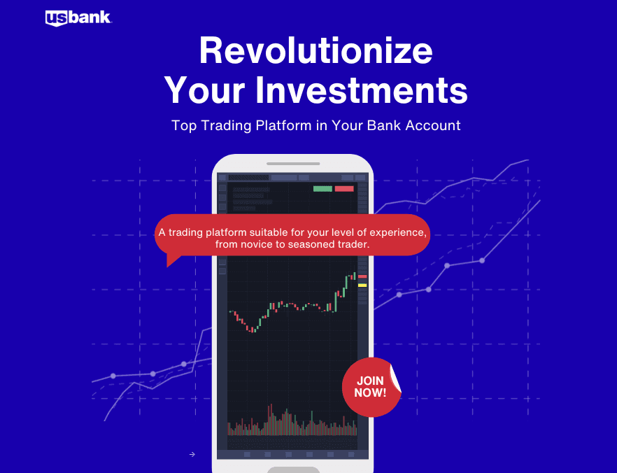
U.S. Next Gen Investing
Platform UX
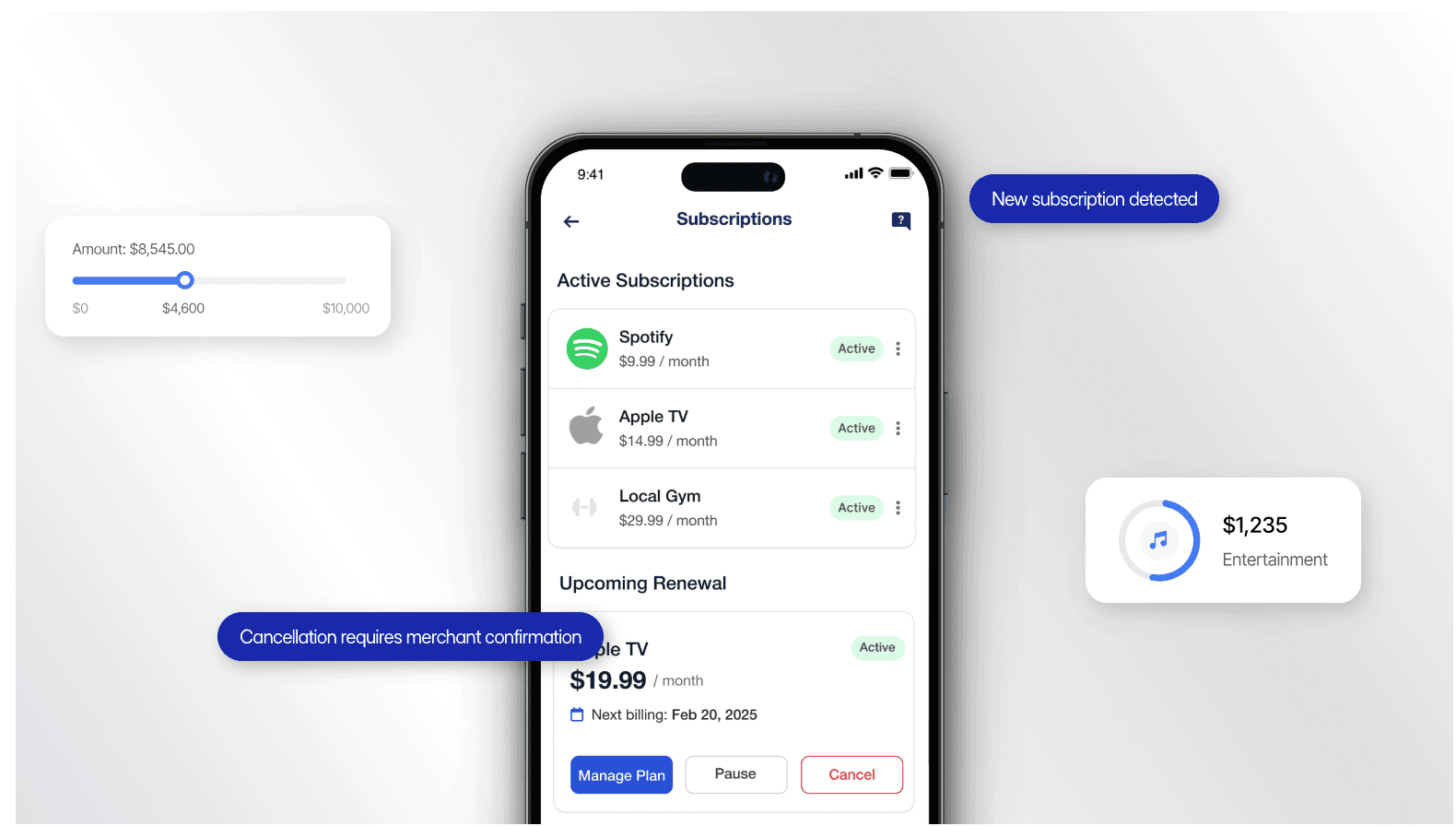
U.S. Bank Subscription Management
UI Design
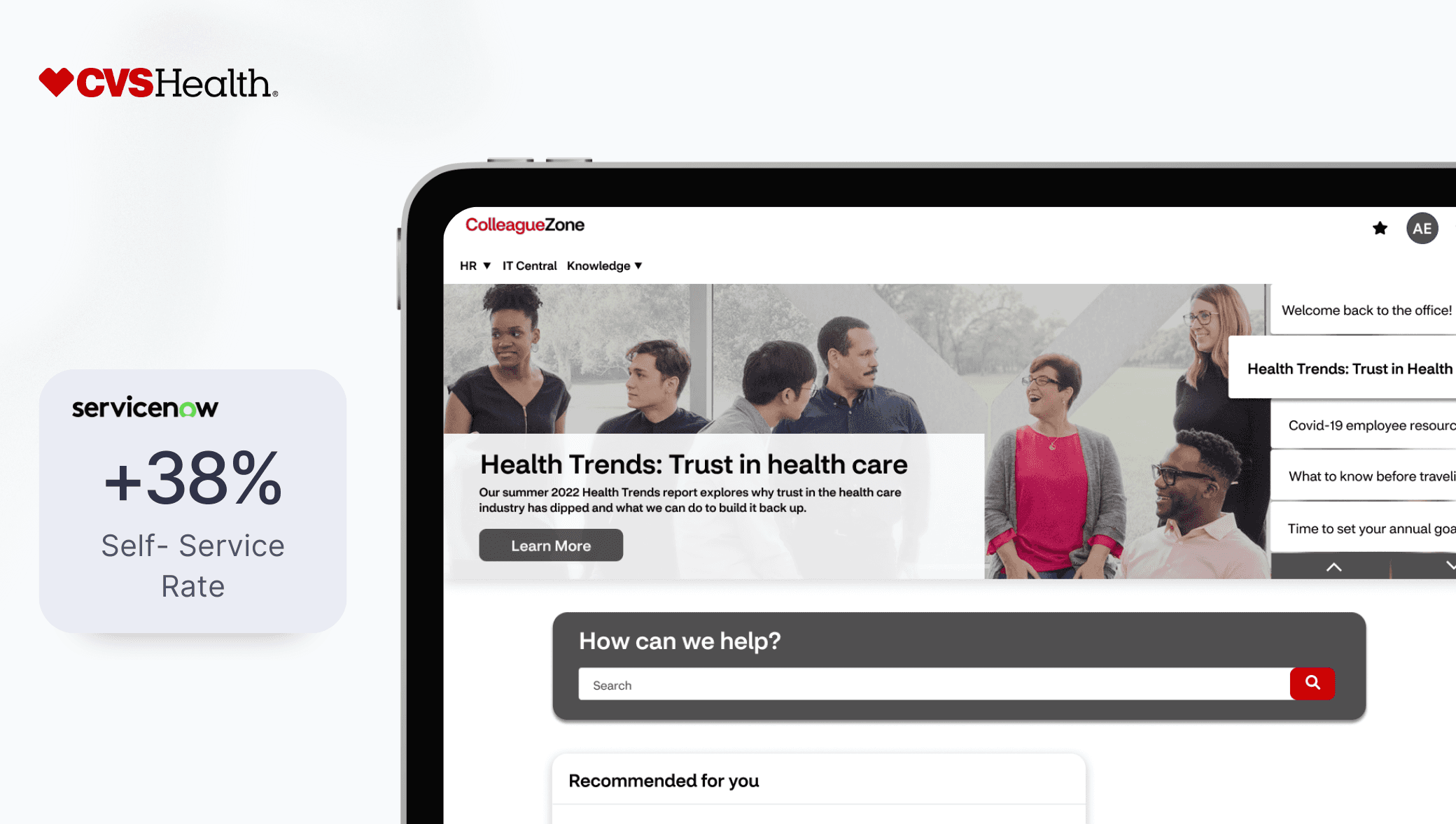
ColleagueZone
ServiceNow Platform Design


